A typical dream of single men is to find out where there is an abundance of lovely young women, without much male competition around. As a single man, odds are you will try to avoid sausage fests. Maybe you have a preference for, say women with higher education? Or Asian women? With the detailed area information given here, finding love should become, still not easy, but at least way less difficult.
Single women, they're much the same - enjoying the company of handsome hunks. And typically they aim to pair up with fit, educated men, relatively close in age. If you're a single lady, not unlikely you have a preference for men of a certain ethnicity. Hang on, the world just became easier to navigate for you as well.
The US Census Bureau last month released their most complete US population figures to date. The dataset we used contains estimates for population figures for 2018. What's more, we've even included historical population data, all the way back to 2009. Now you can see how dating conditions might have changed because of demographic movements, from year to year. It's never been easier to get the relevant population statistics by using the map designed especially for single people, here at Singlesatlas.com.
Since it is so common for single people to date others similar in age, ethnicity, body type and level of education, knowing where the demographical conditions are good can be very useful for the love hungry.
The map has a few easy to understand choices where you specify your tastes for a possible partner. When you enter what you like, the colors for locations on the map will guide you. Green means relative abundance, while red implies that it will be less likely you will be able to find and attract someone you fancy there.
Men, would you like to date slim, white women below thirty-five?
This is a typical desire many men have. The map can help find locations where plenty of the mentioned kind of women live, and competition is manageable. Using those population statistics, and county based estimates for Body Mass Index derived from the US Health Map, the Singlesatlas is able to guide you.
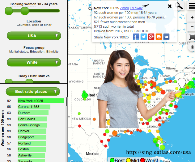
The image on the top of the article shows a snapshot of the map, with the preferences "looking for women 18-35, white, and with a BMI below 25" selected. Click here to open an interactive version of it.
The most populated places within your map view will be marked. A sorted list with the ratios of your selected kind of woman, relative to the total number of men in the selected focus (marital status, education, or ethnicity) and age group is shown. So in this case the ratios of white women to white men, aged 18 to 34 years is shown.
The top recommendation is a ZIP code area within NYC, namely New York 10025. This central Manhattan location has an estimated 92 white women living there with a BMI below 25 for every 100 white men, ages 18-34. This is a great number for men. Compare for instance this to El Paso, New Mexico, which only has 29. And probably many of those women will already be taken out of the dating pool. Inevitably there will be a lot more competition for dating such women down there.
Now, the reason ZIP code 10025 is shown is not random, it's because there are a lot of people living within that ZIP code area. And as you remember, the map selects which ZIP codes or cities to show based on the number of people living there.
Ok, so already there are a lot of possible greenspots to investigate further.
New York City, zooming in
Having decided that New York is great for men, a next step for the avid dater would be to zoom in to see which local areas have the most promising population distribution.
Notice that the whole Manhattan area appears bright and green. The brightness is there, since that is where the amount of your kind of women is the highest per square mile. You will definitely see a lot there. The greenest ZIP code area is New York 10075, with the best ratio in Manhattan. Having an estimated 127 white, non-overweight women, for every 100 white men, in the 18-34 age group, your remaining question might be, can you afford to live there?
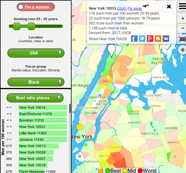
Women of New York City, what to do about this?
There are a lot of eligible good men there, interesting, educated, of healthy weight, in good jobs. This is known. The problem is your competition. Especially Upper East Side seems hard. One option, when you feel inspired, is to use the map to look for areas where circumstances are beneficial for you.
For women fancying for instance black men, NYC has many high concentration areas. I've included a snapshot below of a map view a woman might use.
Where to go to find obese, single American men in their thirties?
I'll leave you with just one more example. This could be what an overweight woman might look for, in order to optimize her odds of finding a lifelong partner. Even though both men and women value healthy weight in their partners, a study led by Andrea Meltzer suggests that marriages are happiest when wives have lower BMIs than their husbands. The leader of the pack is Springfield, Missouri, with an estimated 45 obese single men per 100 single women, in their thirties. Compare this to the populated New York ZIP code area 10025, where the ratio is only 12 such men for every 100 woman.
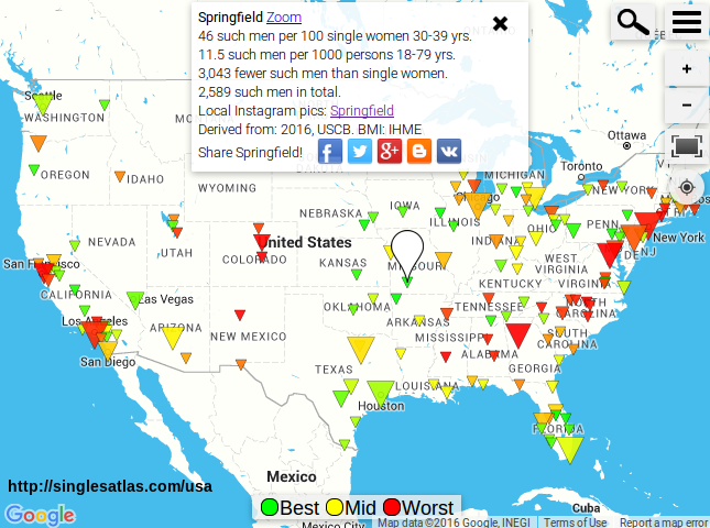
As usual, the places with the highest ratio of this kind of man compared to the total number of single women will be the most green. Click the map for an interactive version, where you can move around the map and look for your own greenspots. And if you prefer men of different BMI groups, simply slide down the BMI range selector to your liking to see how this gets reflected in the map.
I've done my best trying to make this simple and informational. Something might be unclear of course, or even upsetting, cheerful or tormenting. Did your check out your own area, or perhaps the global view? Feel free to contact me, or write your comment below.