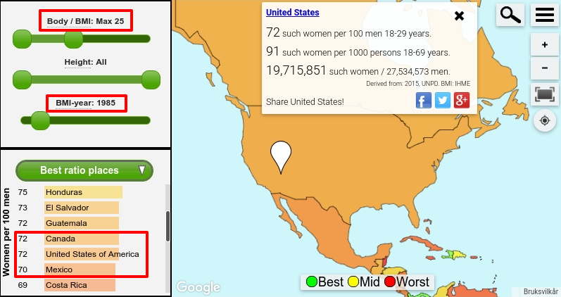
Take a look at the map above. The colors indicate the amount of women aged 18-29 who were not overweight, relative to all men in that age group. It shows that in 1985 the chances for a young man of meeting a young woman who wasn't overweight were about the same in Canada and the United States. There were an estimated 72 such women for every 100 men.
Things have changed since then.
Sharpest decline in the United States
Due to the global obesity epidemics, the ratio has declined. For 2015 the estimated ratio of non-overweight women per 100 men in the 18-29 age group was down to 45 in the United States. For Canada, the figure is considerably higher at 62. Which means as of 2015 there should be about 38% higher chance of capturing the heart of a woman who is not overweight there, as compared to in the United States.
Non-overweight is here used in the meaning of having a Body Mass Index below 25. For example, for somebody being 5'7", they are considered non-overweight if they weigh less than 160 pounds.
When looking at this from a female perspective, the decline in non-overweight men during those years 1985-2015 is lower, but shows a similar pattern.
It is worrying that the weight increase is sharpest in younger age groups. Yet, surprisingly little is being done to tackle the problem.
Age-based BMI numbers are from the Institute for Health Metrics and Evaluation (IMHE). The population numbers used are from the United Nation World Population Prospects estimates and are fixed, from the year 2015.
An interactive map combining sex ratios and BMI statistics
The numbers above can be found using the following map. There are various sliders, that in their current settings have been set to show relative chances of finding a partner for men looking for non-overweight women, for the year 2015, in the 18-29 age group.
You are free to adjust the sliders and move the map around, to discover interesting demographic facts about the current state of our World and changes over time. You will find that out of the roughly 200 countries represented in the map, only 10 countries have a lower relative number in the aforementioned groups than the United States.
How did the countries develop so differently?
How obesity levels grow is a result of how societies change. Naturally there are a multitude of factors involved. I will put out a theory for one such factor that has to do with business differences in Canada and the United States.
Canada has an economy that to a large degree relies on oil and other natural resources. Earning competitive amounts in the food industry is difficult. The potential and incentive for adding excess food into the marketplace is therefore limited.
The United States on the other hand has a much more diverse economy. Due to recent globalization trends many of the country's products are increasingly being produced in other countries where labor costs are lower. For American companies there is a competitive advantage in the food industry in particular. This is because people demand fresh food that is produced in the United States. Increasingly effective marketing helps keep up the demand for more and more food. Which is good for the bottom line of the country's food businesses, but probably not for those looking for a partner in the healthy weight range.
Which food people eat is to a high degree emotional. Ability to resist temptation is a limited resource. The industry has specialized in exploiting this. The direct result is that the general population will gain weight. For instance:
- It is well known that it feels better for people to make a good deal. Presenting such incentives to buy will inevitably lead people to eat more.
- Several scientists regard sugar as an addictive ingredient. Evidently, when putting sugary products in front of people, this creates an increased overall level of temptation.
"Two chocolates for the price of one? Fill me up!"
Do you have other theories why obesity has grown at a much more rapid pace in the United States than in Canada? I welcome your comments below.
Obesity estimates are adjusted for education level and ethnicity
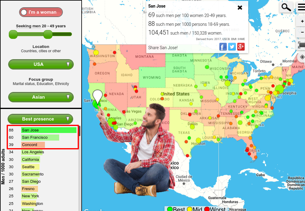
For the United States there is education and ethnicity information from the American Community Survey included. If you are a woman you can find where ratios are good from a female perspective. For instance, you may view estimates for the number of non-overweight Asian men aged 20-49 living in different parts of the country. Colors from green to red of places on the screenshot below indicate how many such men there are compared to Asian women.


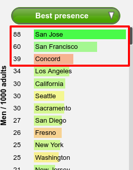
The list shows estimates for how many such men out of 1000 people aged 18-69 live there. This varies greatly across the nation. The top place San Jose has been labeled as the Capital of Silicon Valley. The two next on the list, San Francisco and Concord, are close by.
Local data for many countries
The Singlesatlas map offers local estimates for many countries. To focus on another geography, select from the Location dropdown menu.
These are just a few examples of what you can discover when using the atlas. I hope it will make it easier for you to get ideas for what are statistically good places to look for a partner of your preference.
Disclaimer: Information presented here should not be regarded as scientific research. Take no important decisions based what you see in this website.

 By Singlesatlas, updated April 14th, 2020